6 Jul 2024
How I use Design Tokens for consistent and scalable UX
I’ve been spending time thinking about consistency in design lately - how to maintain a regular look and feel across multiple platforms, devices, and components without manually untangling a pile of hardcoded values.
Easy to manage consistency like this isn’t a nice-to-have… it’s critical for good UX. When you can make things predictable, it reduces cognitive load for users.
This is where design tokens have made a huge difference in recent projects. Whether I’m working on a SaaS platform built in TypeScript + React, or a simpler WordPress build, design tokens have helped me build more consistent and scalable designs.
For those who might be new to this concept, let me walk you through what design tokens are, how they work, and why they’ve been so valuable in my projects.
Why consistency is essential in UX design
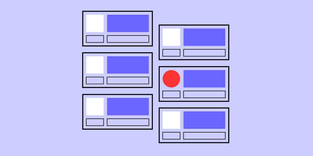
Consistency is the most fundamental aspect of good UX because it shapes how users feel. When designs look consistent, users can quickly learn how to navigate the UI, making their experience smoother and more intuitive.
On top of this, the aesthetic usability effect means users perceive more attractive designs as easier to use. When your design is consistent, it feels more polished and professional, which can make users think it's easier to use - without changing functionality.
Finally, consistency improves accessibility. Predictable visual elements and interactions make it easier for everyone to use products, including people with visual impairments or learning disabilities. By maintaining consistency, you're not just making the product better for impaired users - you're making it better for everyone.
What are design tokens?
Okay, so design tokens are a way to store your design decisions in a centralised, reusable way.
Instead of hardcoding things like colours, font sizes, or spacing directly in each component, you define these styles as tokens (i.e. variables) to be used across entire projects.
For example, instead of writing #FF5733 (an orange colour) directly into your CSS, you’d create a token like primary-color that holds the value #FF5733. Then, anywhere you want to use that orange colour, you reference primary-color instead of the actual hex value.
The beauty of this approach is that if you need to update the colour later, you change it in one place, and it propagates through the entire website/app. This is a game-changer…
How design tokens helped me in a SaaS project
A few years ago, I was working on a SaaS project for help desk software built in Next.js. This project needed a robust design system to make sure everything - from buttons to modals to forms - looked consistent.
Without design tokens, managing consistency across a large application like this would have been extremely challenging. (Nightmarish, even).
Each time we needed to update colours or spacing, we’d have had to manually update multiple components and stylesheets, increasing the risk of design debt through error.
But by using design tokens, we centralised all our design values in /style/theme.ts:
With these tokens in place, we could then pass them to a /app/Layout.tsx via a ThemeProvider from 'styled-components':
Finally, I can pass these values down to the individual component in /components/Button.tsx:
Why consistency is key for scalability
So far, so simple. But this kind of consistency doesn’t just make individual products easier to use - it also makes them easier to scale.
As projects grow, design tokens make it possible to build out your design system without introducing inconsistencies or bloating your codebase with repetitive styles.
This kind of scalability is super important for large SaaS projects, where new features and components are constantly added, and which might need to work over multiple platforms. Without a centralised system of tokens, keeping everything aligned would be overwhelming.
Experimenting with tokens in a Divi project using CSS variables
While JSON-based design tokens work wonders for complex projects like that SaaS project I mentioned, they aren’t always feasible.
For example, in a recent Wordpress + Divi project, I wanted that same kind of centralised control over my variables. This is mainly because I hate Divi and wanted to take back as much control as possible. (Sadly, I didn’t have the option of choosing another platform)
Instead, I recreated the idea of design tokens using CSS variables. This is a more old school way to handle design tokens, but the concept is the same. Here’s a simplified example of how I approached it:
By defining these CSS variables at the root level, I can now use them anywhere in my stylesheet. Plus, I can do it in plain CSS, without having to create a SaSS workflow.
So if the client wants to change the brand colours or adjust typography (yes, this happened), I could do it by updating the variables in one place. The rest of the site updated automatically, just like with design tokens in the React project.
The key idea here is centralising design decisions in a way that makes them easy to update and maintain. Even in simpler projects like WordPress sites, this approach helps keep designs consistent and scalable.
Conclusion: design tokens as a mindset
At the end of the day, whether you’re using JSON-based tokens or CSS variables, the idea behind design tokens is a mindset shift.
It’s about thinking of your design elements as variables that can be reused, updated, and scaled across your entire project. For me, this shift has made a huge difference in how I approach web projects.
Design tokens help me build more user-friendly products. If you haven’t started experimenting with design tokens yet, I highly recommend giving it a try - you might be surprised at how much smoother your design and development process becomes.
After all, consistency isn’t just about making things look good - it’s about making things work better for your users.